Thursday, April 7, 2016


1.)       One logo that I really like is for the band Queen. I really like it because it has so much going on and the animals are really detaled wich really draws in my attention. I also think it suits that band well because quee/ Freddie mercury was known for being extravagant and over the top in his performances and the complexity of the logo demonstrates that.


2.)


a.)


I really like this logo because the letters/ images seem to intertwine and weave into one another. this image iis really captivating because it semms never ending, and so it does not get boring even if you look at it for a while.


b.)


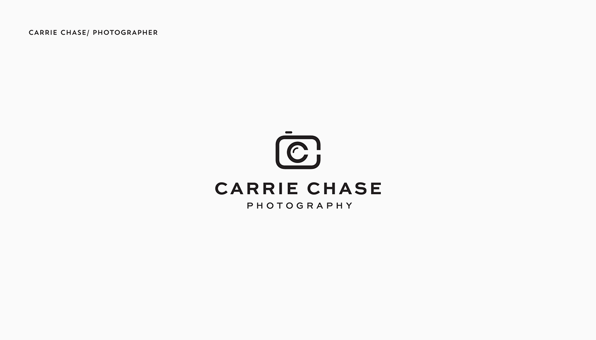
I really like this logo as hhowever for a different reason. this logo while very simple is also very captivating because of it neatness. it also communicates a very clear idea; the company sells photography based products.

c.)


This logo really captured my attention because of the actual husky on the top. the husky is detalied enough to keep your eyes on the drawing for a while, but not to detailed that itt prevents you from looking at the words.

d.)
This logo is very interesting, because of the bike on top. the drawing seems to be some modern interpretation of an actual bike, but less specific. The bike takes on a almost irridecent colour that really captures your attention.


e.)


This logo really captured my attention because I of the colour of the logo and the image in the front. The neon green, in my opinion, really signifies the idea of energy, and the image at the front could be seen as an end to a charger, or a smily face, which keeps the audience wandering, which altiately helps them to remember the logo. 

Monday, April 4, 2016


Original


Final


1.)    I do believe my stance is clear. The reason for this is because as the viewer looks at each TV within the others, their wold becomes more hectic and abstsract, and less realistic. as you get to the most abstract TV, a phrase reads, "Come back to reality" and leads you back to the most basic form of the poster. the combination of  TV's getting more abstract along with the command, indicates that my stance is to not allow yourself to get rapt up in the cyber world, but focus on the real world.

2.) I think That I did successfully re-ceate my original idea drawn out during the thumbnail sketch part of the project. This is because I captured the idea of a person who is so invested in the vertual world that his realty changes.

3.) One change I made from my first to my final draft was the figure in the poster. Originally the figure was just a stickman, who stayed the same throughout the entire poster. However by the ende, I changed the figure into an actual person (me) who began to black out as he got closer to the top corner of the poster. I made this change because it was more visually appealing, and I thought that it better conveyed the idea that a person changes if they become to intertwined with the virtual world. Another chang I made was the colour scheme of the background. In the origibnal draft, the color scheme was completely random, however in the final draft I placed the most vidsually captivating colors such as red, and put it in the center, and slowly made the colors less and less captivating. This guided the reader first to the top left corner of the poster, and then slowly to the bottom. This way the reader would read the poster properly, instead of backwards.

4.) I think that my design is the strongest part of my project because I really used color for a purpose, and my font type was also used to help create an anxious feeling within the reader, because the letters are sharp. My skill and techniques was the worst part of my project because I am not very skilled with iillustrator, so I could not use/ did not know how to use very many tools
 to enhance my project.

5.) The most challenging aspect of this project was figuri g outr how to cvonvey the idea that technology was harmful to people when used in extreme doses. This is because I had my idea of looking into a TV within a TV within a TV, but I couldnyt figure out how to convey the fact that each

6.) The most challenging aspect of the project technically was gettibng pictures of myself and placing it into the project woithout the white space in the background. to do this i had to place it into photoshop first and get rid of the white space in the photo, and then place it in the project on illustrator.

Wednesday, December 23, 2015

1.)      My Gif project symbolises my love for music. I came up with this concept, because right now i am really interested in writing my own mucsic, so I wanted to express that in some way. I decided that this project would be a good oportunity to express my creation process visually. when I record music use an adapter to record the sounds that i creat on the guitar. the computer than makes sound waves as it proccesses the music. I mimicked the basic layout of what the computer would look like as im recording. The instruments in the background slowly deform to show how playing music takes me to different places.

2.)


3.) nThe thing that changed the most in my project from the beginning of the project is the movement of the instruments. when we first started this project, i wanted to make the instruments move in the way that they normally would. for example, the strings on the guitar would move back and forth, and the piano keys would move up and down. however i decided to distort the instruments instead for two reasons. the first being that my original plan was to intricate to actually finish by the deadline, and the other being that by fusing the instruments into the background as the sound waves were digitalised onto the computer showed how i believe that once you start playing music, its not the instruments that matter, but jst the music that is created.

Sunday, November 29, 2015

Portrait Transformation  Reflection


1.) 
       
       For this project, the concept I was trying to convey was how people sometimes alter past memories/ experiences in their head by continuasly worrying about them. My idea was to try and make it look as if a person were poisoning his own memories. In my project, a person was placing his hand in space (the purple background). The purple space was ment to represent the persons own mind, because the conscious mind is not a physical object, and memories often seem to be in an endless supply, like space. out from the persons hand came a string of lines as if he was poisoning this emptyspace himself.


2.)
           Title:   Altered Space


3.)

    Although I am satisfied with my project I see where it could have been improved. The project is very basic. not much is going on, and thinking back on it, I probably could have added a little bit more detail to make it more appealing, and catch more people's eyes. That being said, this was my first time ever using photoshop and altering my art so dramatically using technology, and I believe that my project conveys its intended idea, wich is most important to me.


4.)


5.)
One thing that was very difficult for me was making and inserting the black design coming out of the persons hand. my first step was to actually draw the design, wich was tedious because I didnt want to smudge it or make it look messy/ unprofessional. Once I drew the design, it was scanned and copied onto my conputer, at wich point I had get rid of all of the white space in the image. to do this I selected all of the wiht space in the project, and deleted in from the image. once this was done, I recognised that some of the lines were not dark enough, so i used the pain brush tool, and painted the lighter lines, dark black. once I did this, my last step was to copy and past it into my profect file, in a layer that was on top of the purple design, but under the person.

Tuesday, October 27, 2015


  1. Describe your process. How was the process helpful or not so helpful to you? Show us your brainstorming ideas and thumbnail sketches. How did you arrive with your concept/idea for your letter? Did the peer feedback help? Show us your brainstorming ideas, thumbnail sketches, and two drafts. 
  2. What did you do to represent your concept visually in your design? (Give 2 examples and post close up and full design images) 
  3. What was the most challenging aspect of this project for you? Why?
  4. Are you satisfied with your project?   Explain your answer.
  5. If you can change anything about your design, what would you change or do differently?
1. when i was first trying to figure out what my desighn would be, i thought of words that started with the letter R, or thinking of diferent emotions that are evoked when thinking of the letter. for me, the letter R has  and sometimes violent connotations. many of my ideas were coming from words that evoked these emotions as well, like rage, rat or robbery. This idea did not work though because i could not think of any ideas that were visually pleasing to me. instead i tried to think of objects that could potensially mimic the curviness of the R. this is where my final idea of a waterslide came from. the waterslide was perfect because it could be curvey nd squigly. i didnt really consider my pier feedback when making my final, because i felt like the feedback was not detailed enough to convince me to pursue another idea.

2. One thing i did to represent my concept was i created the staircase to replace the straight line in the R. in order for people to actually get on a waterslide, they have to get to the top somehow, so i had to include the staircase to make it realistic. Another thing i did was I added all the little rings that divided the waterslide. waterslides are usually made up of multiple tubes that have been screwed together. this cteats rings in the middle of the waterslide, so i tried to recreate this immage in my project.

3. The most challenging aspect of this project for me was coloring in my design. i did not want my final to look 1 dimesional. i wanted it to have a lttle bit of depth, but because the waterslide was cylindrical, i could not just use a box shape. i had to use shading to make my waterslide look 3 dimensional, and realistic.


4. i am satisfied with my project because i think that i was able to successfuly disguise my R  as something else. what i mean by this is that the object looks like an R, yet it still genuinly look like a drawing of a waterslide, because waterslides are ment to be curvy. If this was not a letter project and we just had to draw an object, this project would still suffice.

5.if i could change one thing about my design, i would create a more detailed background. i dont think that my background actually affects my project in a positive way. i could have put in house, trails, or other waterslides of differrrent sizes to create more deapth in my project.